Designing a letterpress printed book is different from designing a book for contemporary book production. The historic technologies and equipment put limitations to a lot of design choices, i.e. selection of the fonts, line length, type of paper etc. Read more about the obstacles our designer Mana had to cross while designing the layout for the book.
TYPOGRAPHY
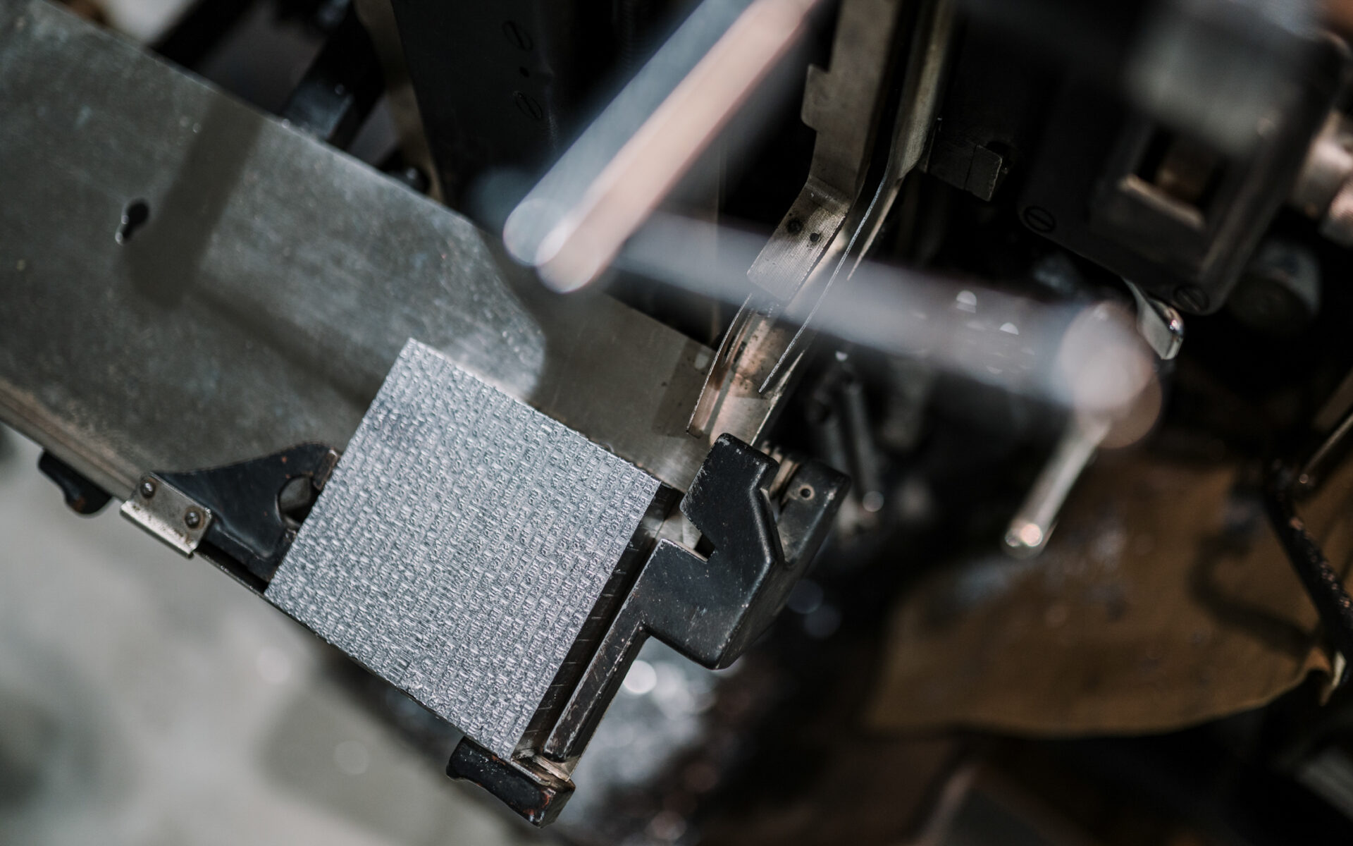
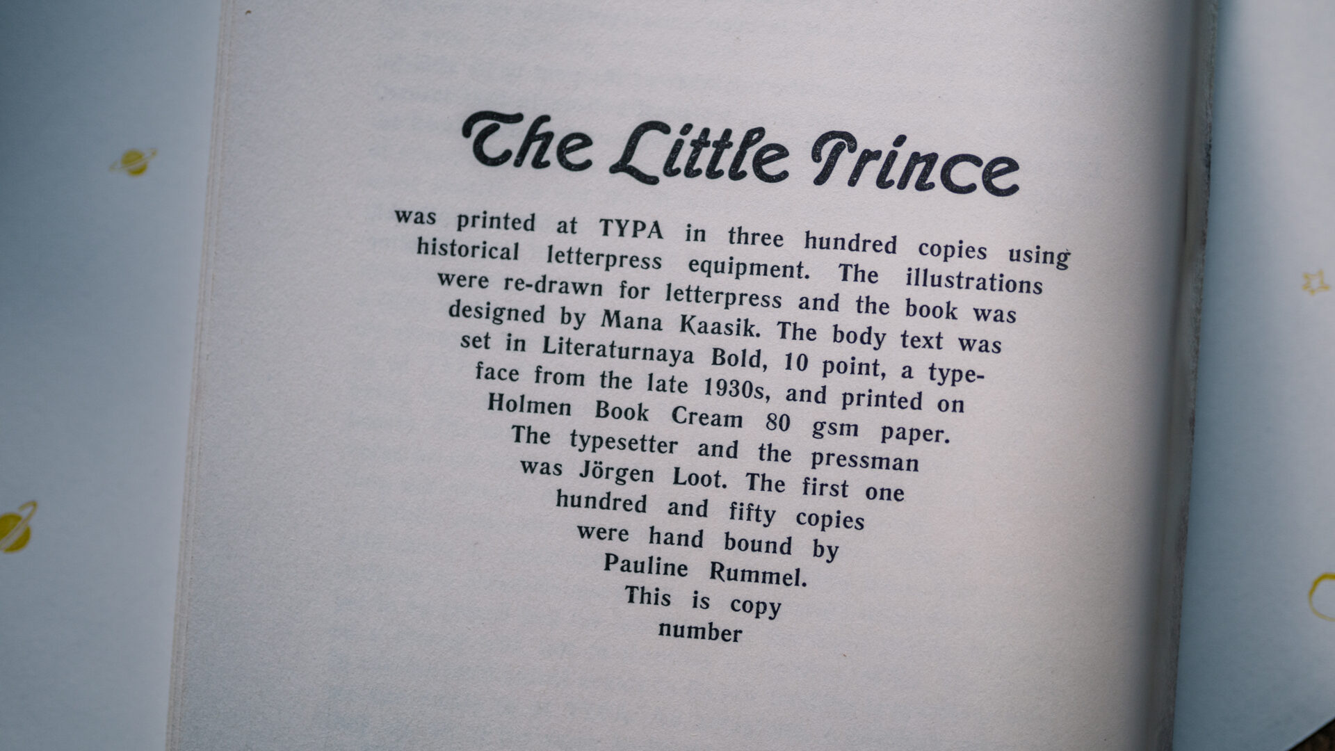
The big question “What font should we use?” was quickly answered. Since we were going to cast the text with a Linotype, the choice was limited to the selection of Linotype matrices in our collection. Most of them were either too small, too big or from Cyrillic alphabet. Luckily, there was just one set of matrices (almost) perfect for the book: Literaturnaya bold 10 points. Literaturnaya was designed in the late 1930s for Poligraphmash type foundry. Basically it’s a copy of Berthold’s typeface Lateinisch.
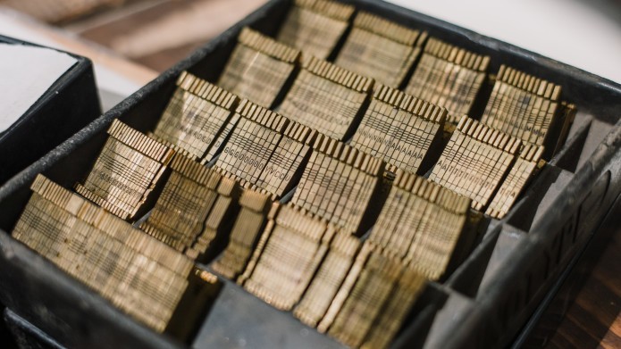
As mentioned before, the matrices were almost perfect so we were forced to follow English grammar more creatively…
- There’s no italics. This means that the monologues or the book titles (i.e. True Stories in the first chapter) could not be printed in italics as would be the correct way.
- There’s no é. We are going to draw the acutes by hand. (In 300 copies!)
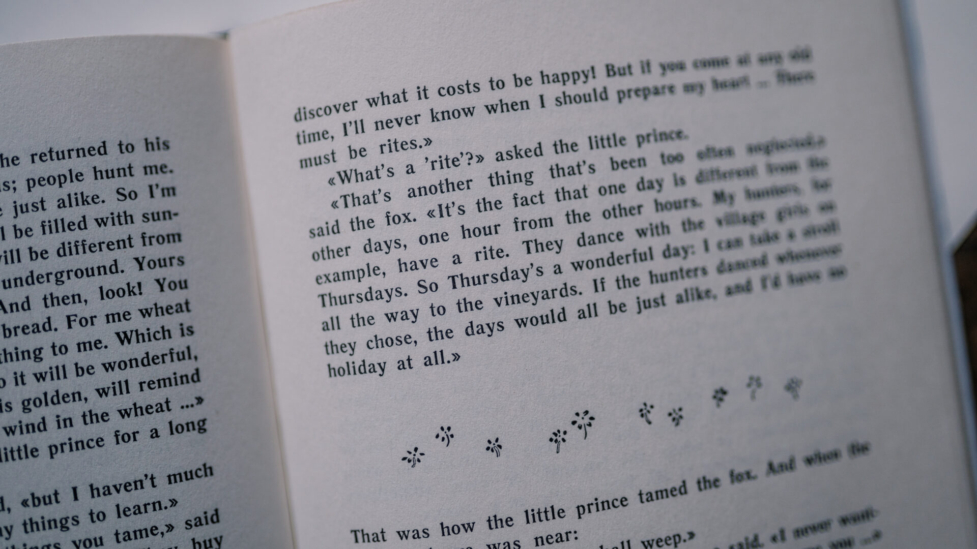
- English quotation marks (“…”) and the left single quotation mark (‘… ) are missing. Here the designer worked together with our English editor (Kristopher Rikken) to come up with the best option available: we used guillemets («…») for the dialogue and monologue, and right single quotation marks (’…’) to emphasize some words or mark dialogues within dialogues.
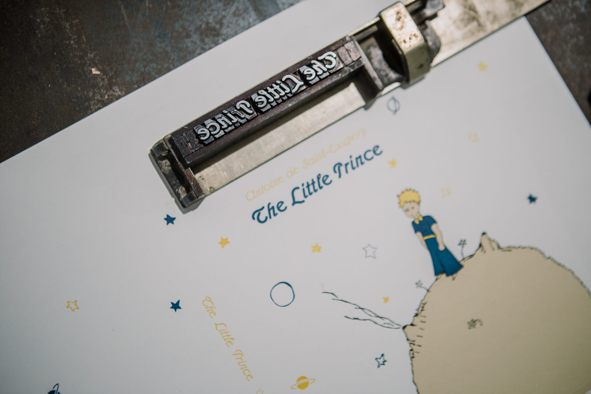
Another font used in the book is Admiral (from a German type foundry William Wöllmers). This is a decorative font from our movable type collection that we used on the covers and for the illustration titles. We chose this font to print the title of the book and the illustration titles, simply because it reminds us of the font that was used in the first edition of Le Petit Prince.
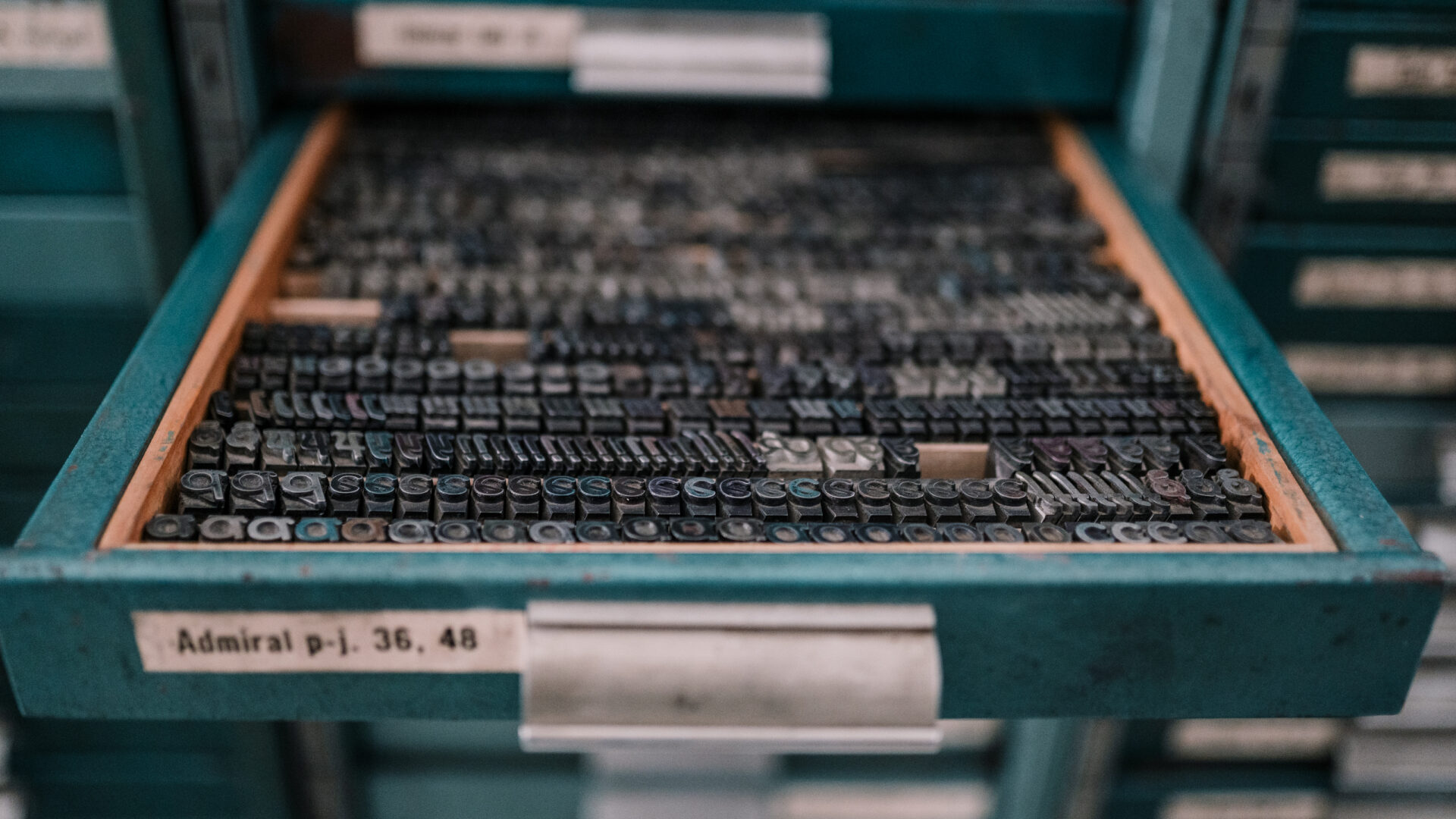
There were also problems with the Admiral typeface: the smallest size in our collection is 24 points which is too big for the illustration titles. The best option here was to handset the illustration titles, letterpress print them, scan the images, clean and resize the text to finally make pdf-s for ordering the printing plates.
LAYOUT
Once the font was settled, we purchased the digitized version of Literaturnaya. Our designer was first going to create the layout, which would be used as an example for casting the lines of text.
There was one concern: the first test showed that the digitized font fitted more characters in a row than physically possible with Linotype – even with the same font size, the same line length and the same adjusting. To fix this – to get the digitized font flowing in the same rhythm with the real-life Literaturnaya – the designer spent some hours experimenting, and finally found the right settings for letter spacing, word spacing and leading.
Besides figuring out good and comfortable line lengths, leading and margins, she also had to spend a great deal of time getting rid of any layout mistakes, such as widows and orphans or bad hyphe-na-tion. This was mandatory to do before the actual (composing) work started as these mistakes can only be avoided with prior planning.
ILLUSTRATIONS
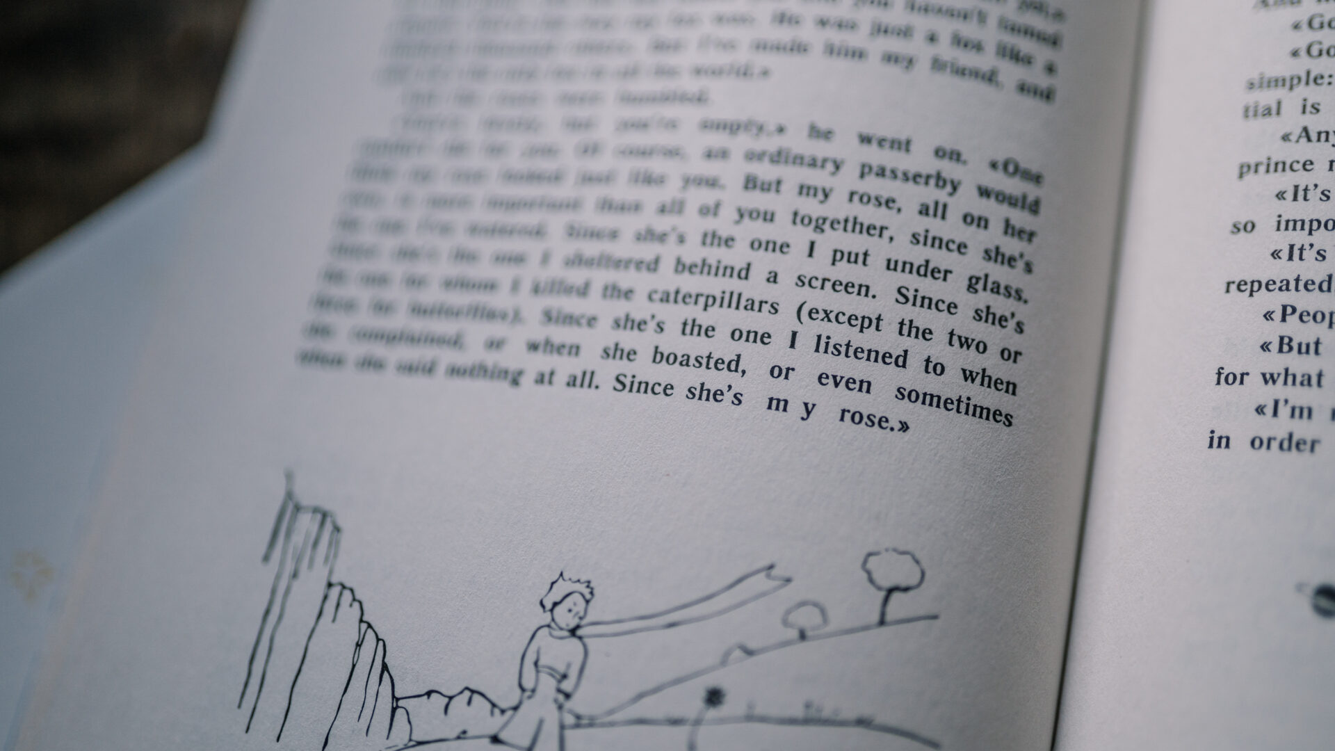
The first edition of The Little Prince was printed in offset lithography – a printing technique which allows the printing of many colours and colour gradients. Letterpress sadly doesn’t allow us to print such kinds of illustrations, so we had to make them suitable for the technology available. In letterpress, each colour is printed separately, so we decided to go with simple black-and-white illustrations for the inside of the book as was common in the letterpress era.
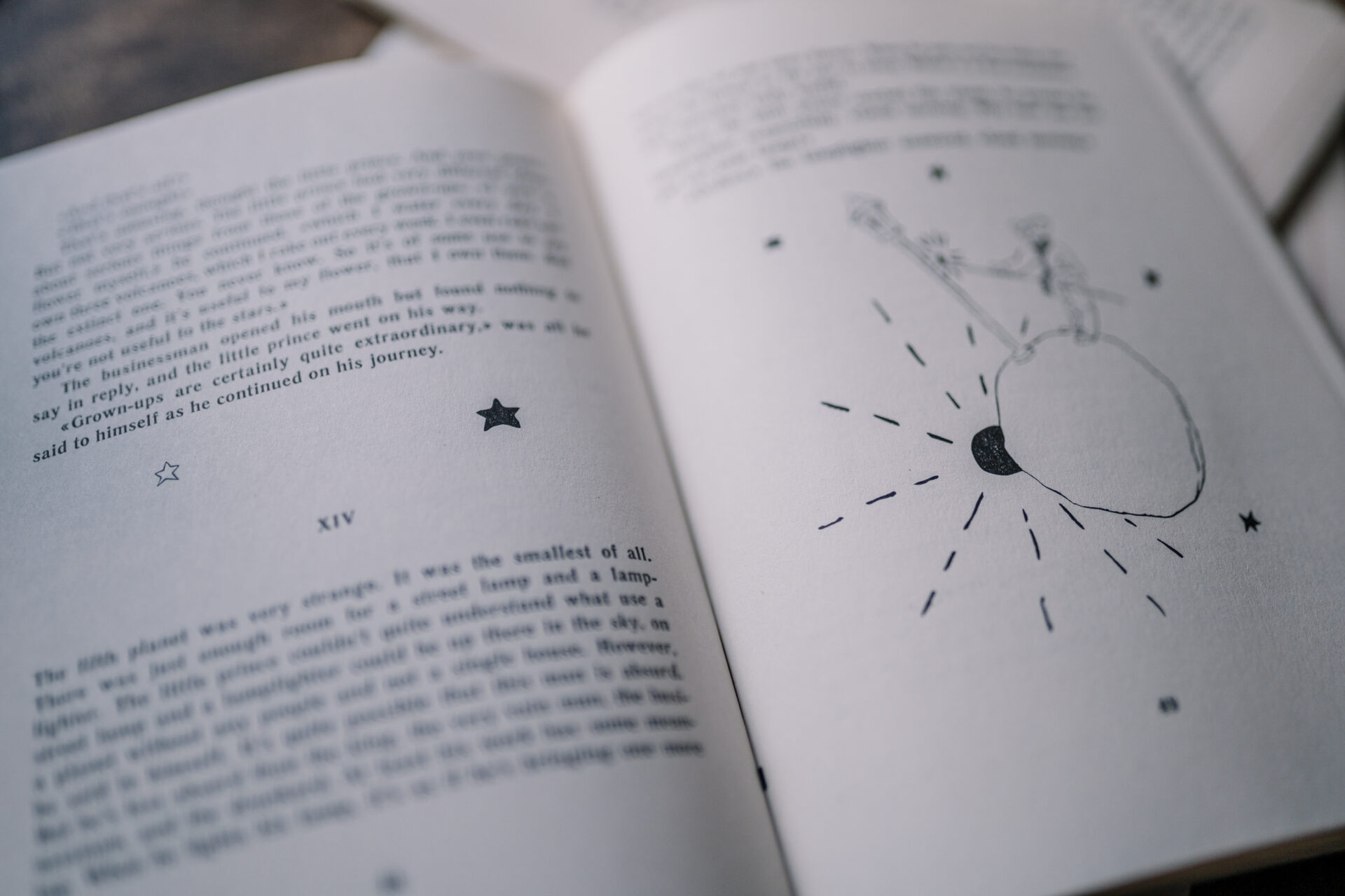
Two other local graphic designers, Liisi Reitalu and Maria Kanatova helped Mana with this task and together they redrew illustrations for the book. Besides the original illustrations there are also many drawings of stars, planets or flowers between the paragraphs.
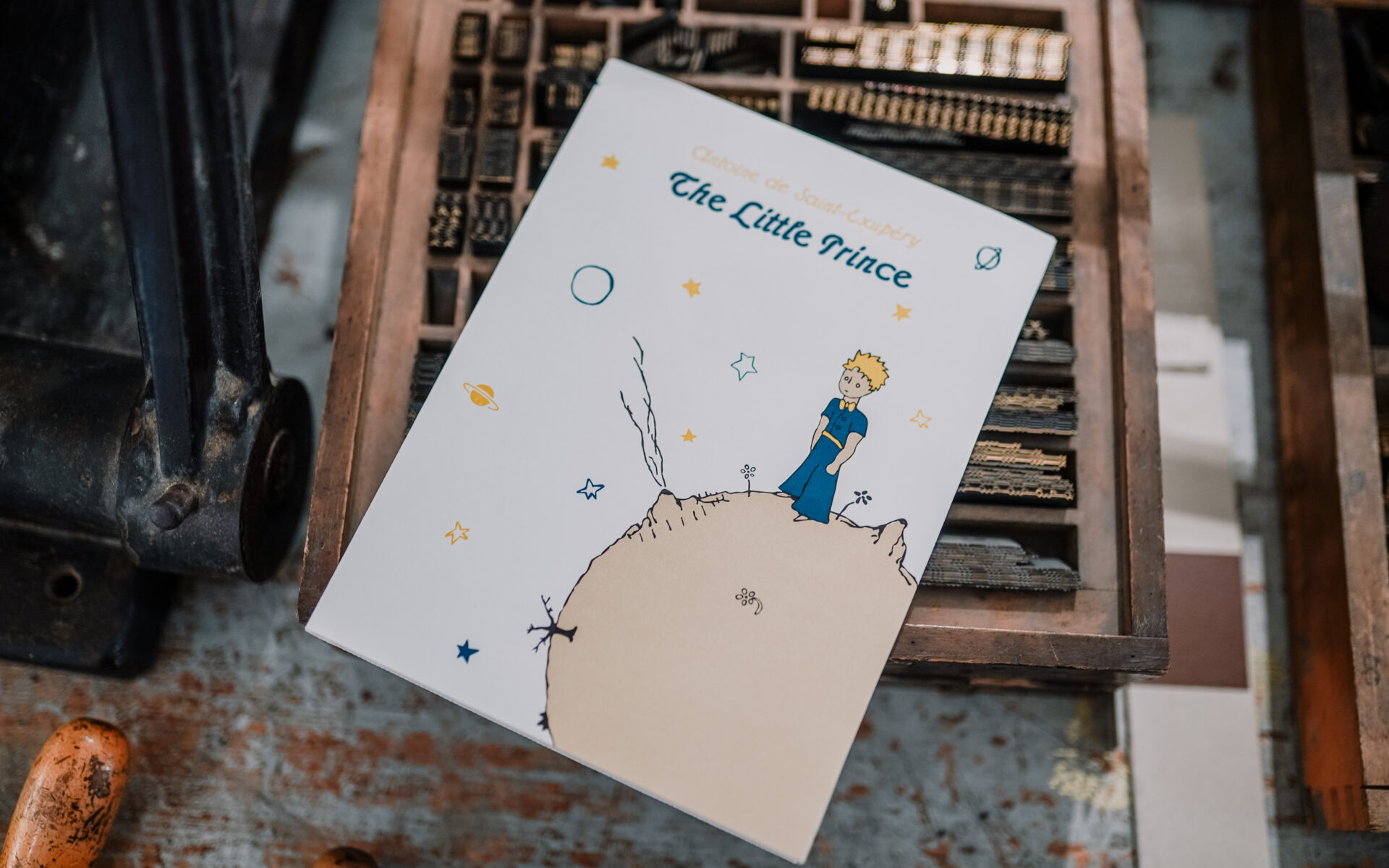
While the content of the book is in black and white only, the dust jacket is printed in four colours. (We’ll talk more about the dust jackets in the printing update – printing them was a much longer story).
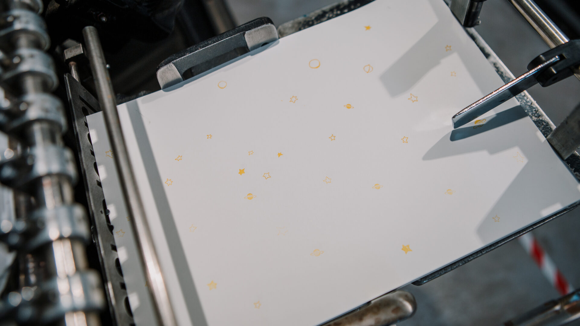
Finally, the endpapers were also letterpress printed. To create this pattern, we reused the clichés with small stars and planets – the same which were used to print illustrations found between chapters.
The Little Prince book design:
- Book design: Mana Kaasik
- Illustrations: Liisi Reitalu, Mana Kaasik, Maria Kanatova
- Fonts: Literaturnaya bold 10 p, Admiral regular 24 p
- Content: Holmen Book 75, 80 gsm paper (letterpress printed, one color)
- Endpapers: Munken Pure 150 gsm paper (letterpress printed, one color)
- Dust jacket: Munken Pure 150 gsm paper (letterpress printed, four colors)
- Covers: full-cloth, natural linen (hot foil embossing)
- Book size: 155 x 206 mm